
For the rapidly growing direct-to-consumer eyewear company Ace & Tate I designed their new e-commerce platform. A mobile first user experience supporting the Ace & Tate brand proposition: Affordable and fashionable glasses for any outfit and any occassion. Helping people buy a product that is normally perceived as a medical device, expensive and cumbersome to buy especially online.
At the end of 2016 I was approached by Mark de Lange, CEO of Ace & Tate. Within just three years after founding the company, they opened two stores in Amsterdam, one in Utrecht and a pop-up in Rotterdam. But as a direct-to-consumer brand, e-commerce plays a vital role in the business model. Their current website couldn't keep up anymore with the chaning company and rapid growth.
Objectives
- New design to fit the brand and replace the old generic design
- Easier to use product configuration
- Higher conversion, lower friction during checkout
- Inspire customers through look books and (seasonal) campaigns
- Store finder for all the new stores to be opened
- Increasing the brand value of Ace & Tate
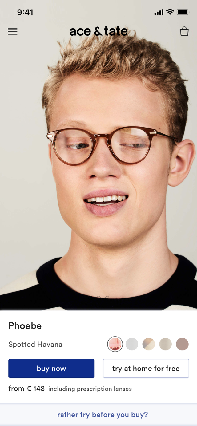
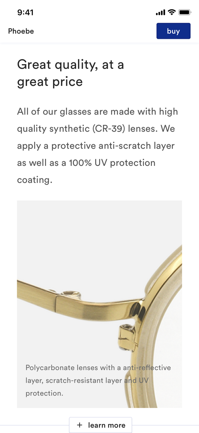
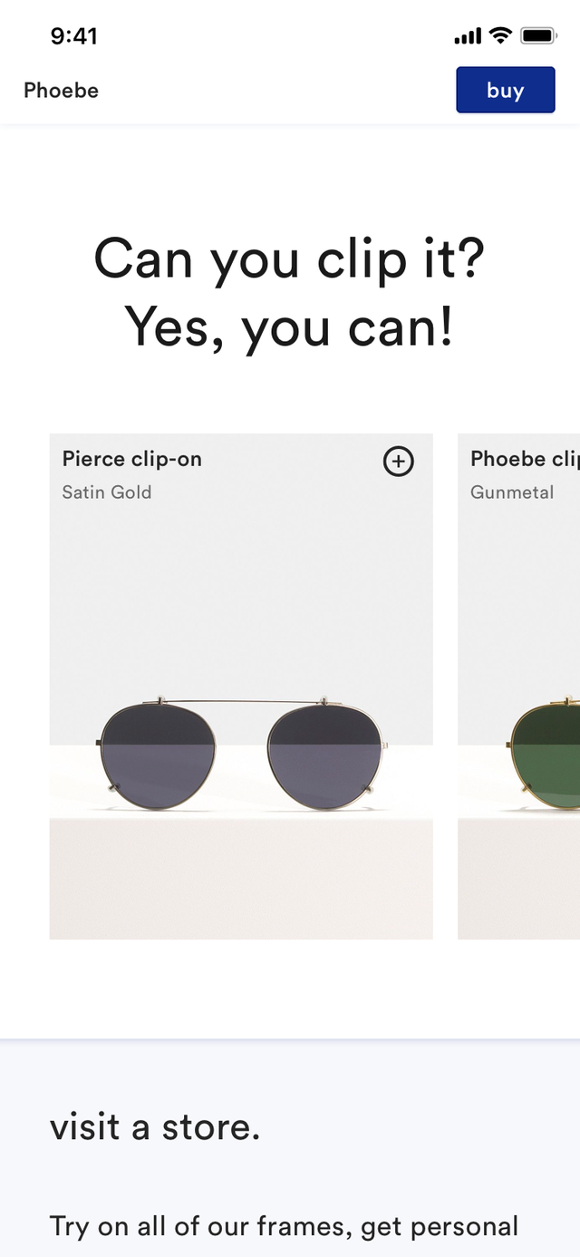
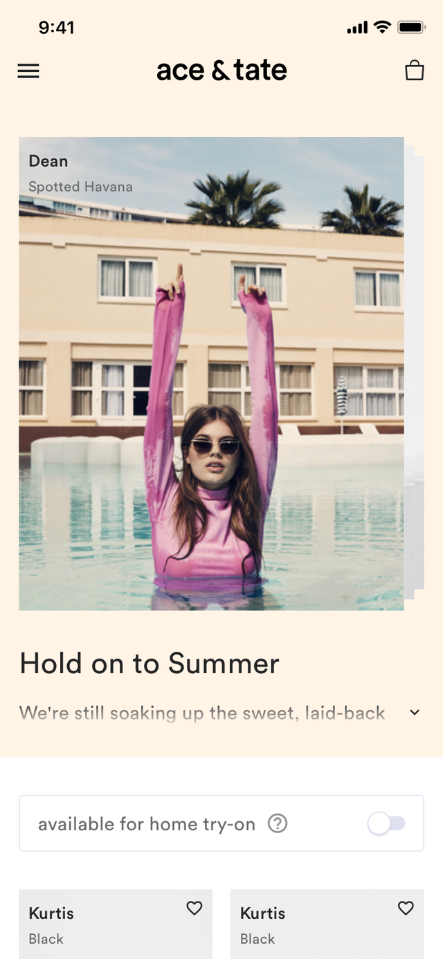
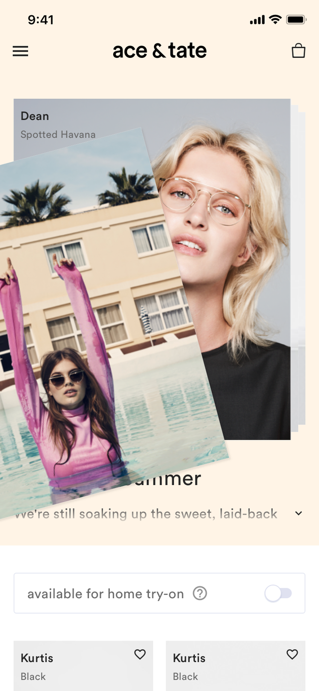
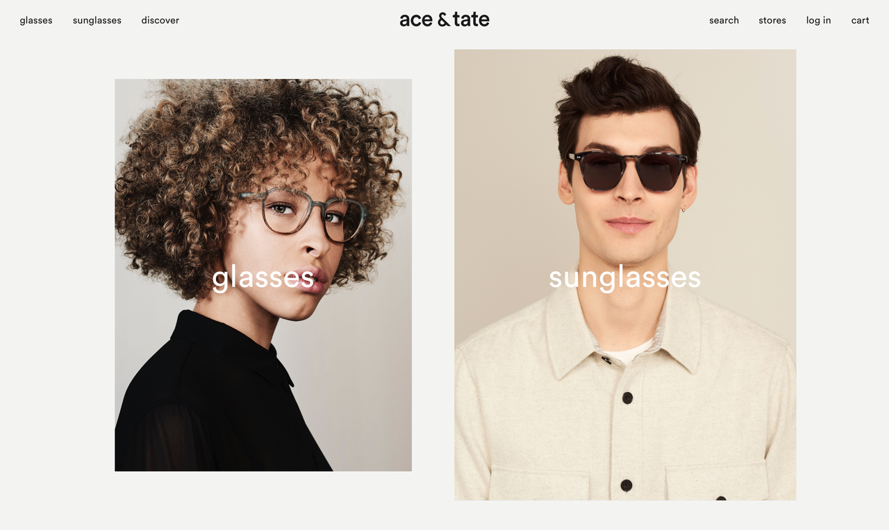
A mobile first driven experience, that not only inspires but also creates context around the product with high quality photography of the glasses being worn by people with all types of faces
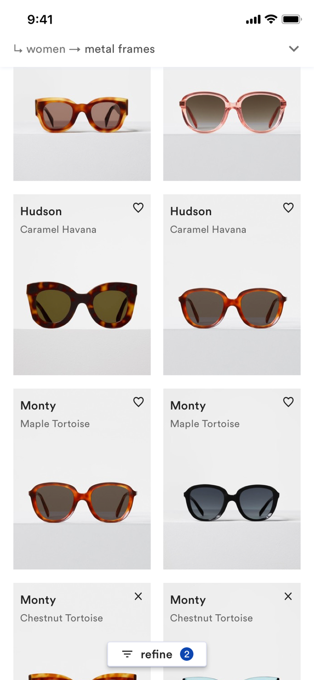
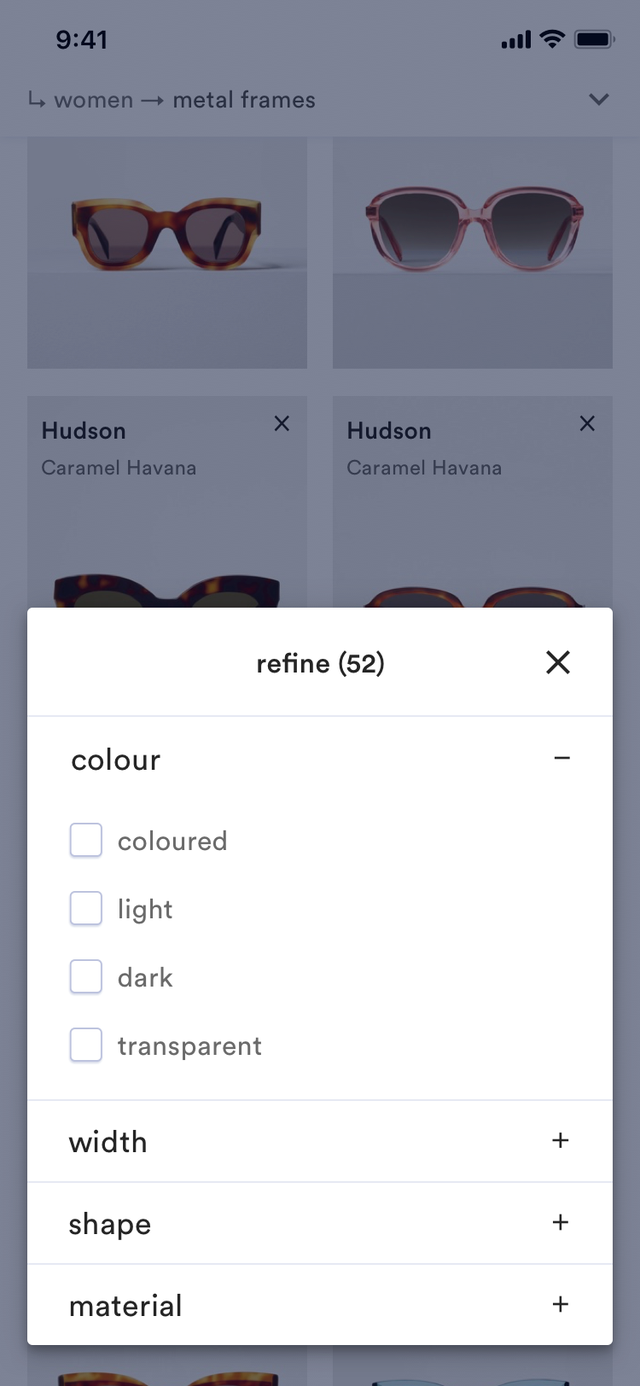
Non-hierarchical way of browsing the collection by not only filtering on properties (gender, color, material) but also tags or taxonomy (style, release, occasion etc). No more 'white wall' filled with every frame in every color, telling the user 'this is all we offer, good luck'.
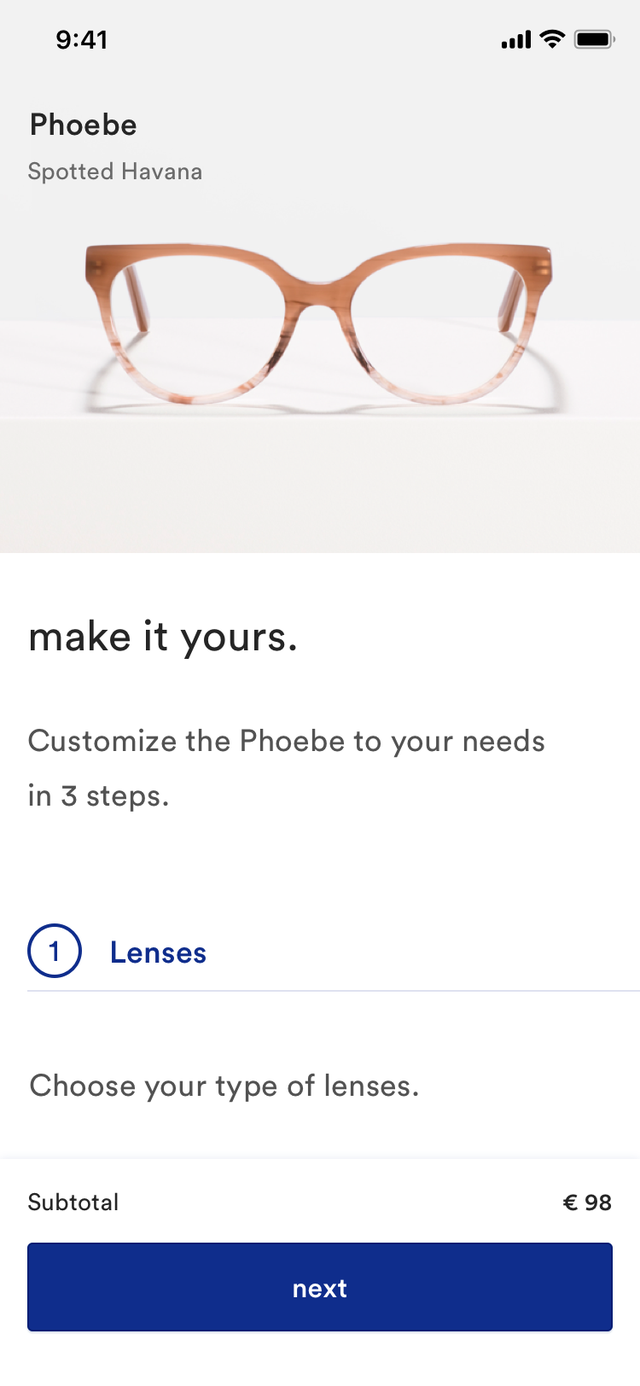
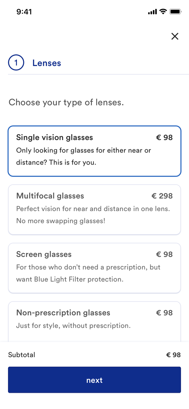
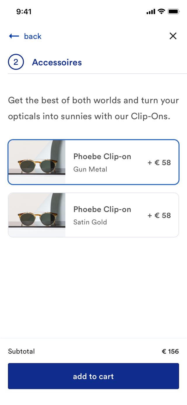
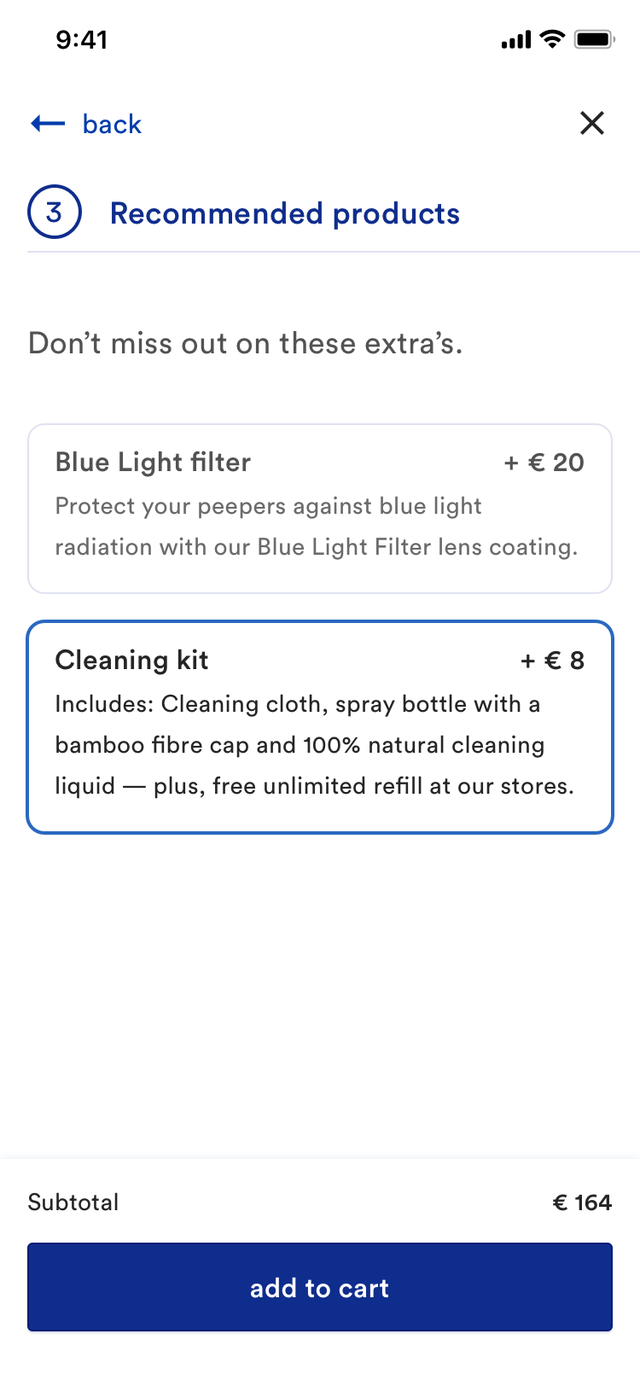
A smooth and easy configuration a newly designed product configurator.


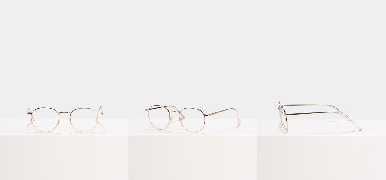
New high resolution pack shots to showcase the quality of the frames but are also recognisable as Ace & Tate when out of context, ie. shared on platforms like Instagram and Pinterest.
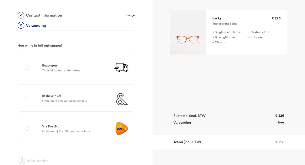
A clear check-out optimised for conversion through a clear, stepped design. The steps are specifically ordered to ask only the absolute necessary information for a transaction as soon as possible so that a sale can be finalised with the help of customer service if necessary.
Results
- grew the team from 1 designer and 2 developers to 3 designers and 6 developers
- set-up a collaborative design workflow using Abstract and Sketch
- designed the overall concept and UI of the new online customer experience
- designed the information architecture of the Ace & Tate e-commerce platform and product taxonomies
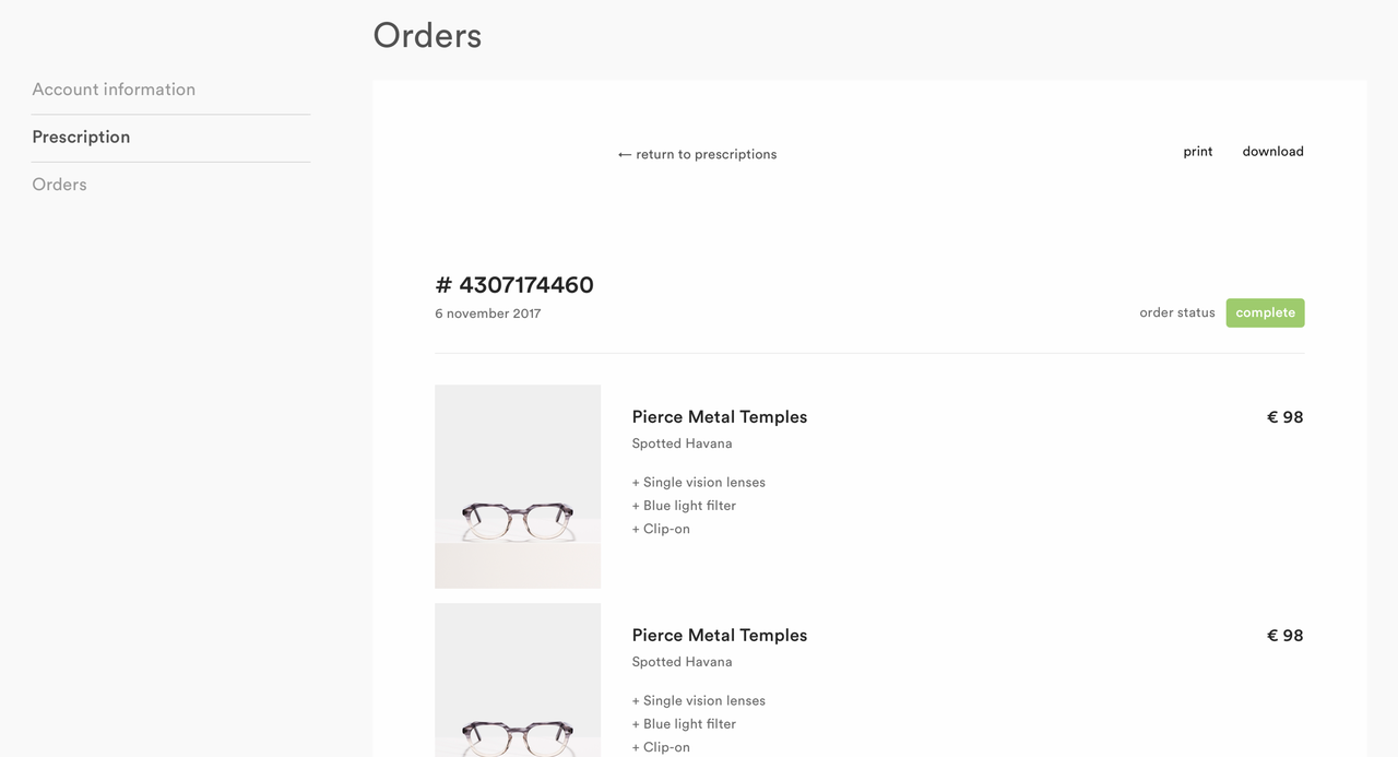
- designed the UX of the website, including check-out and customer (self-)service environment
- new concepts for the product photography and head shots
- designed seasonal campaigns, won a Awwward for the Lernert & Sander campaign (of which I also did a part of the front-end)
- increased conversion and thus revenue (I'm not allowed to share any numbers)